Software can be complicated. My job is to make it feel simple.
Hi, I'm Patrícia, a Product Designer. For the past 2+ years I've worked on enterprise software across management, healthcare, and AI — helping turn complex workflows into products that are simpler to use. Along the way I've shared research and design decisions with teams and stakeholders in Brazil, Germany, and Mexico.
Some of the work I've done
Start with the problem, not the screens.
Most projects start with a simple question: where are people getting stuck, and why? From there, I test ideas with users, share the reasoning with stakeholders, and use systems thinking to keep the work consistent. More recently, I've also been prototyping in code with Claude Code, so ideas can be tested in a way that feels closer to the final product.
Let's talk
Have a role, a project, or just a question? I'd love to hear from you.
Get in touchA designer who's happiest untangling the complicated stuff.

I'm a Product Designer based in Brazil, working remotely with teams around the world. Over the past 2+ years I've designed enterprise software across management, consulting, healthcare, education, and AI — the kind of products where a single unclear screen can cost someone their whole afternoon.
What I love is the untangling: taking a messy B2B workflow and finding the clear, human path through it. That means real user research, thoughtful information architecture, and design systems that keep things consistent as products grow. I've presented strategy and research directly to C-level stakeholders in Brazil, Germany, and Mexico — and I've learned that the design only wins when people understand the why behind it.
Lately I've been prototyping in code with Claude Code, turning concepts into interactive React components so validation happens faster and handoff to engineering is smoother. I'm fluent in English (C2), native in Portuguese, and open to remote roles anywhere.
How I got started in design
My path to UX and product design was anything but straightforward. I started by following my curiosity about the natural world — first studying veterinary medicine, then biology. Both fascinated me, but something was missing: a creative spark I hadn't yet found.
That spark came when my sister, already working as a UX designer, introduced me to the field. Inspired by her work and the impact of thoughtful user experiences, I decided to pivot. I found myself immersed in design challenges, learning to blend empathy, science, and creativity — skills from my earlier studies — into crafting intuitive digital experiences.
Today I'm grateful for the winding road that led me here. It shaped me into a designer who values both analytical thinking and human-centered innovation.
Experience
- Presented design concepts and research findings directly to the CEO and executive stakeholders in Brazil, Germany, and Mexico, helping shape roadmap priorities over multiple quarters.
- Delivered core features averaging 5–6 screens per flow — an AI chat interface, surveys, wiki redesign, card standardization — translating complex B2B requirements into validated hi-fi prototypes.
- Led a full homepage redesign over ~2 months, consolidating fragmented navigation and removing the need for 4+ clicks to reach critical metrics.
- Ran moderated & unmoderated usability tests with 5+ participants per session, delivering prioritized recommendations that shipped the following sprint.
- Expanded the design system with 25+ new components and full documentation, and ran WCAG 2.1 AA audits to support dark-mode and compliance work.
- Led the full redesign of the company website — from competitive analysis and stakeholder interviews through implementation on a no-code platform.
- Worked in parallel agile sprints across three product lines: a public transit app, a patient-tracking system for physical therapy, and real estate software.
- Produced detailed design specs that reduced recurring implementation questions and rework.
Skills & tools
Education
Languages
Let's talk.
Thanks for visiting my portfolio. Whether it's a role, a collaboration, or just hello — I'd love to hear from you.
Your message is on its way. I'll get back to you soon.
Enterprise Dashboard
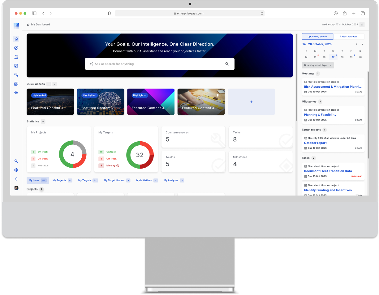
A fragmented homepage, turned into a unified workspace — so users could see priorities, deadlines, and status at a glance.
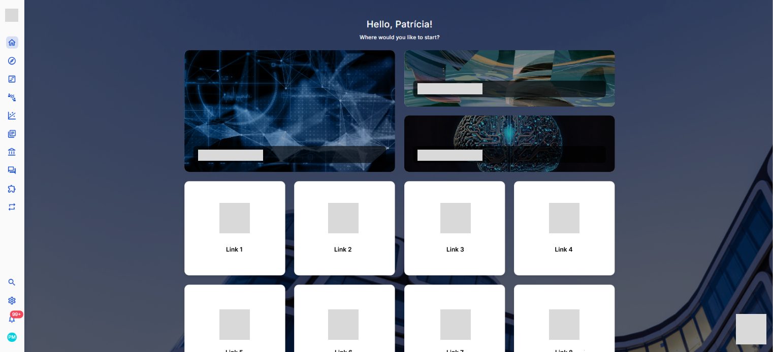
The homepage showed links, not what needed attention.
An enterprise management platform where work spans goals, projects, and tasks. Executives tracked KPIs, project managers monitored delivery, and team members checked deadlines — but they all started from the same link-based homepage.
Users didn't need more information — they needed clearer priorities.
Interviews with enterprise clients, behavioral analytics, and a competitive review all pointed to the same pattern: executives, project managers, and team members had plenty of data, but each had to move between tools to understand what needed attention for their own work.
Tracking work meant navigating across multiple tools.
Different roles used the same homepage, but looked for different signals.
Context-switching between tools interrupted focus.
Routine status checks required opening each tool separately.
The homepage needed to answer “what needs my attention now?” before “where do I go?”
That reframed the homepage from a navigation layer into a prioritization layer. Instead of exposing every entry point equally, the redesign focused on helping each role recognize what mattered first and decide where to act next.
Four layouts were tested before the structure worked across roles.
Each feature was mapped against the users it served before layout exploration began. Redundant navigation paths were removed first, then four dashboard concepts were prototyped and reviewed with enterprise users. Feedback shaped iterations around calendar interactions, tab behavior, and the visibility of the assistant.
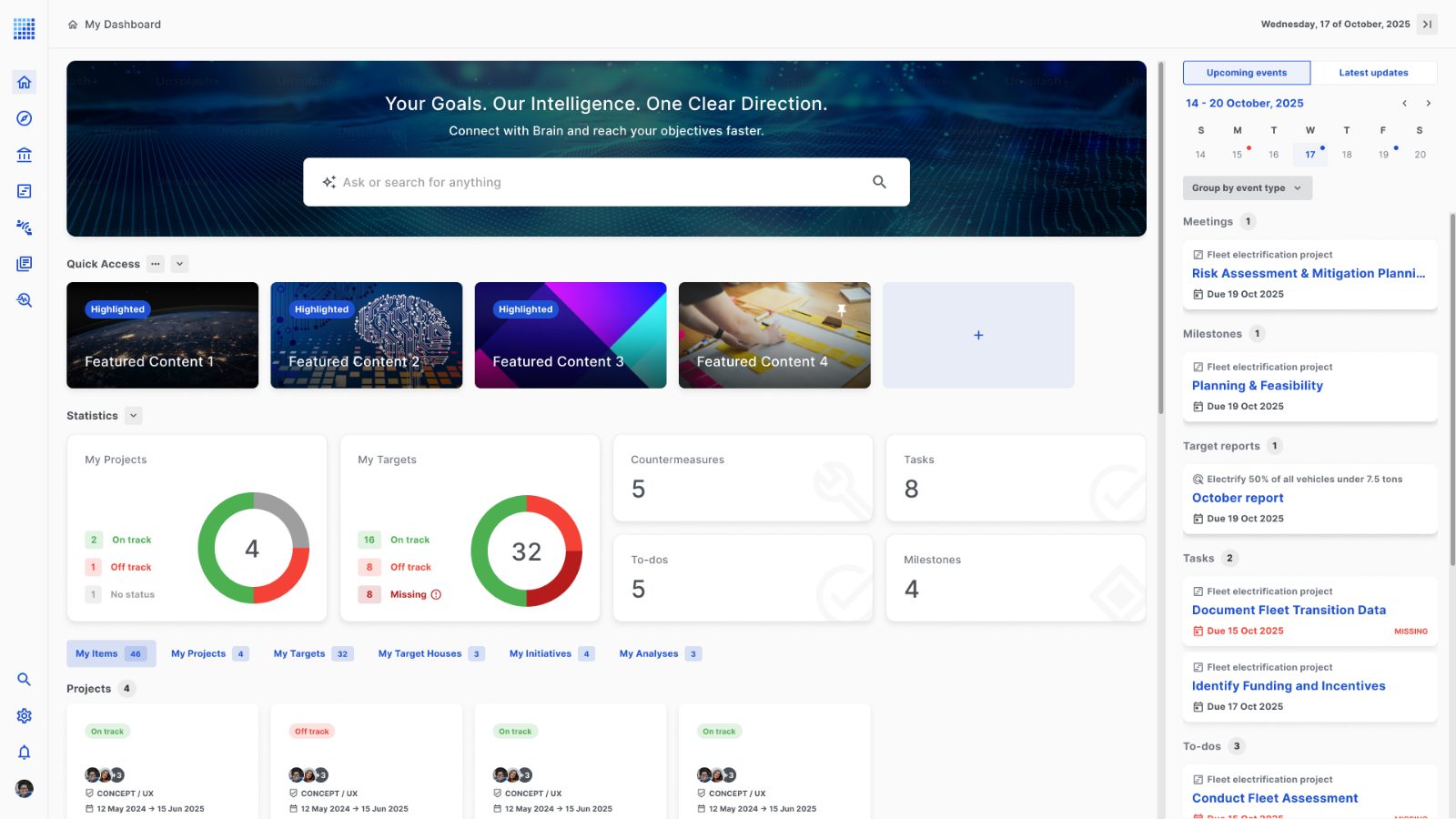
The homepage stopped being a directory and started guiding action.
Navigation became a question users could type, not a menu they had to search
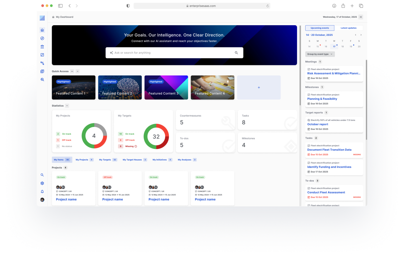
The AI assistant was positioned as a primary entry point for navigation. Instead of relying only on menu exploration, users could ask for what they needed directly and reach the relevant area faster.

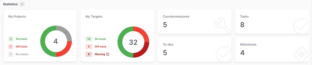
Metrics that lived in separate tools were brought into one row
The statistics section consolidated KPIs across projects and targets into a single overview. Users could scan overall status from the homepage instead of checking multiple tools one by one.
Organizational and personal priorities shared the same space
Admins could highlight what the organization needed visibility on, while users could pin and rearrange the items most relevant to their own workflow — useful at both company and individual level.

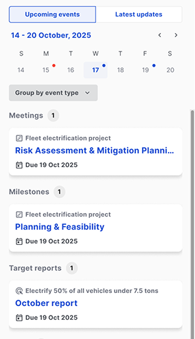
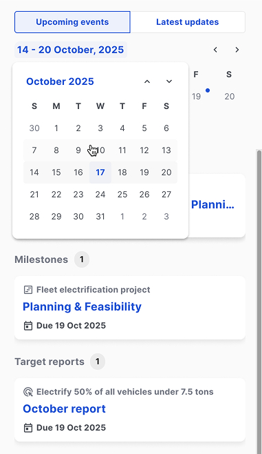
The calendar brought deadlines from different tools into one view
Meetings, to-dos, reports, and tasks appeared in the same sidebar calendar, with filters by type and days of the week. This made time-based workload easier to scan without opening separate modules.
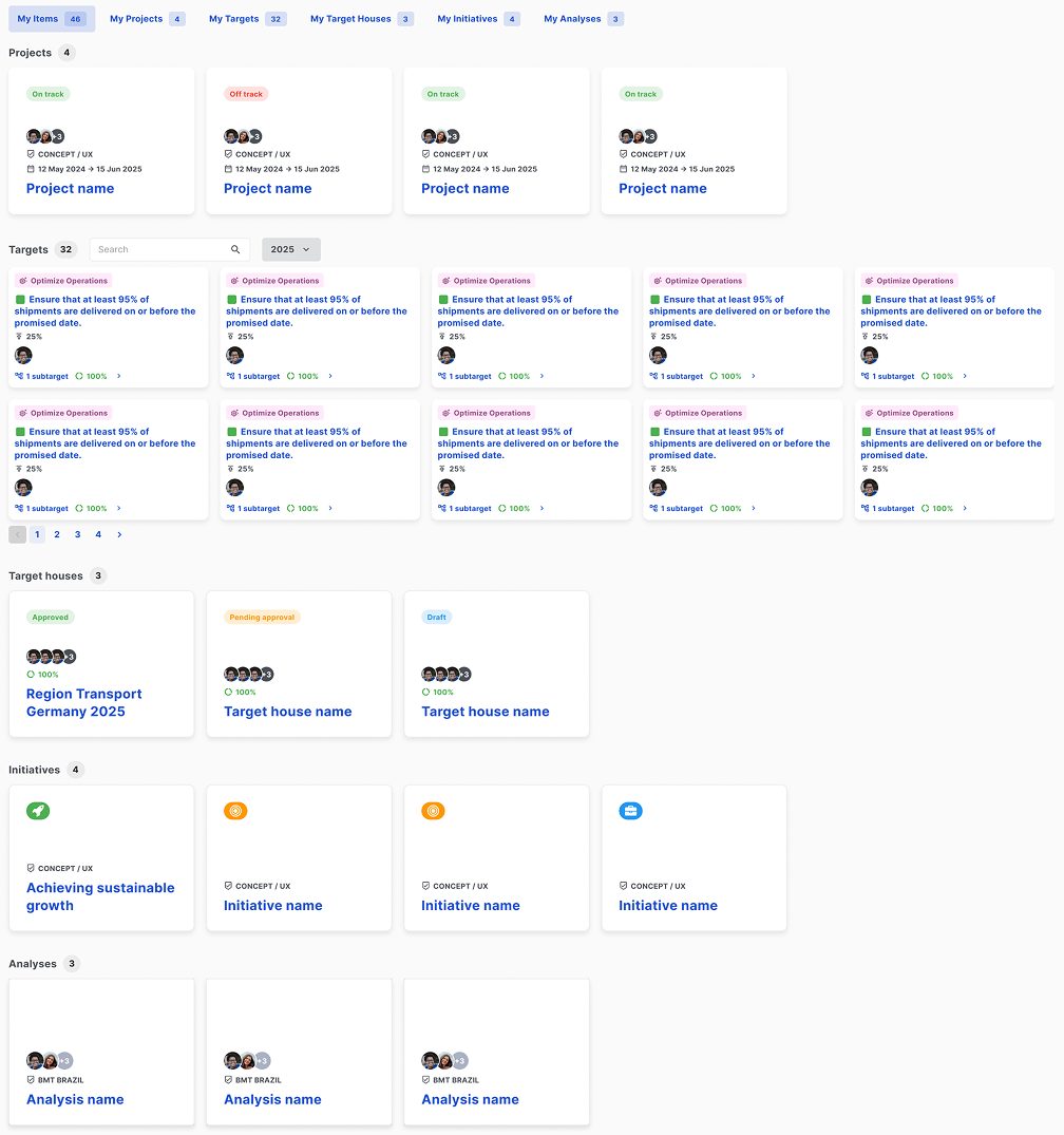
Tabs were organized by the user's relationship to the work, not by tool
“My Items” grouped everything the user owned, edited, or participated in, while the remaining tabs organized content by source. All relevant work was a single click away, reducing the need to remember where each item originally lived.
Shaped by user needs, but also by what was realistic to build.
Some ideas could have created a stronger experience, but I had to balance them against stakeholder preferences, existing product expectations, and what was realistic for development to build within scope.
That meant focusing on changes that would make the homepage clearer and more useful — without introducing unnecessary implementation cost or complexity.
The homepage moved from scattered navigation to a single, actionable overview.
The new homepage reduces the number of clicks needed to reach critical metrics by pulling fragmented navigation into a single dashboard. It makes important information easier to scan in a data-heavy workflow, creates a clearer entry point for moving between areas of the platform, and establishes a more structured overview that can support future feature growth.
- •
Fewer clicks to reach critical metrics — fragmented navigation consolidated into one homepage dashboard.
- •
Important information easier to scan, helping lower cognitive load in a data-heavy workflow.
- •
A clearer entry point for users moving between areas of the platform.
- •
A more structured overview that can support future feature growth.
When users work across connected tools, the interface should help them understand what matters without making them assemble that picture manually. This redesign focused on making priorities easier to scan, compare, and act on.
Brainny Smart Solutions
Turning a rebrand into a clearer, more trustworthy path to conversion.
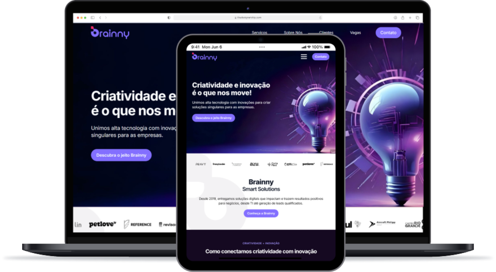
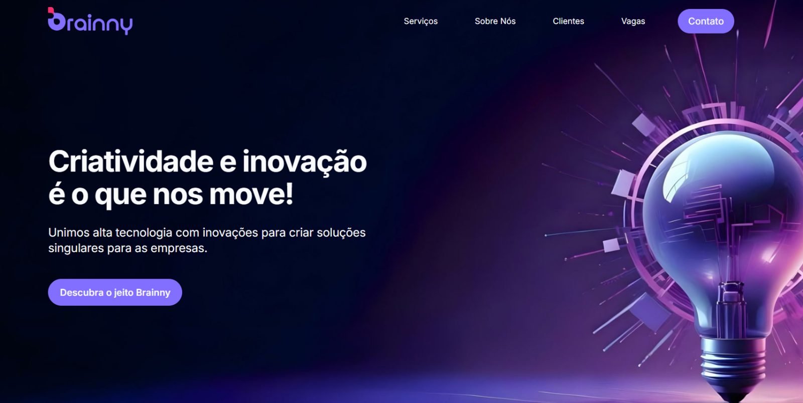
The rebrand needed a website that could make Brainny feel clearer and more credible.
Brainny had gone through a rebranding process with a new logo and color palette, but the website still showed the company's original visual identity. The redesign needed to close that gap while making the business feel clearer, more credible, and easier for potential clients to understand.
The redesign had to clarify the offer, not just modernize the interface.
The old site still carried Brainny's original identity and felt broad, generic, and hard to differentiate in a crowded market. Visitors could see that the company offered digital services, but the experience didn't build confidence fast enough or make the offer easy to understand.
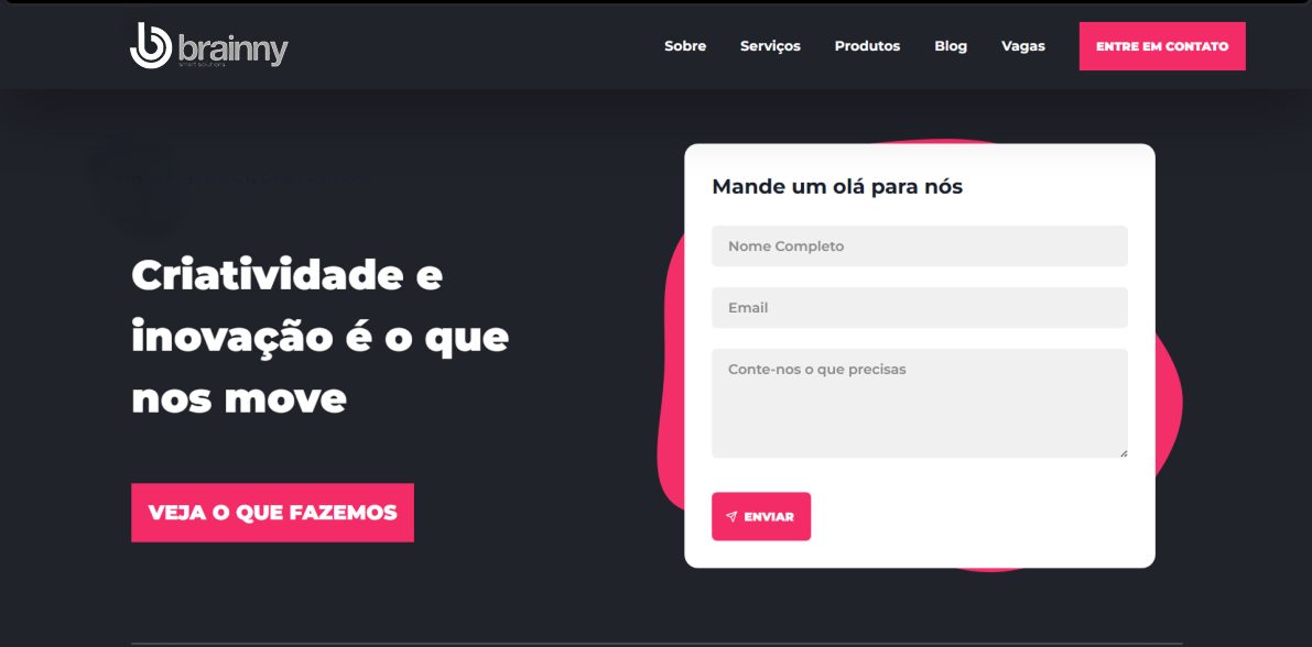
Too many messages were competing on the homepage at the same time.
Brainny's value proposition felt broad, which made differentiation less clear.
Trust signals and calls to action existed, but weren't structured strongly enough to guide decision-making.
I treated it as a communication problem, not a visual refresh.
The key question became: how can the website help visitors understand Brainny's value faster, while making the company feel more credible and more specific? That pushed the work toward structure, hierarchy, and clearer pathways rather than decorative complexity.
Structure for clearer messaging
The site introduces Brainny's value up front, then deepens it on service pages.
Hierarchy for faster understanding
Visual priorities help visitors grasp what Brainny does and why it's different.
Pathways for confident decisions
The flow makes it easy to move from curiosity to contact without guessing.
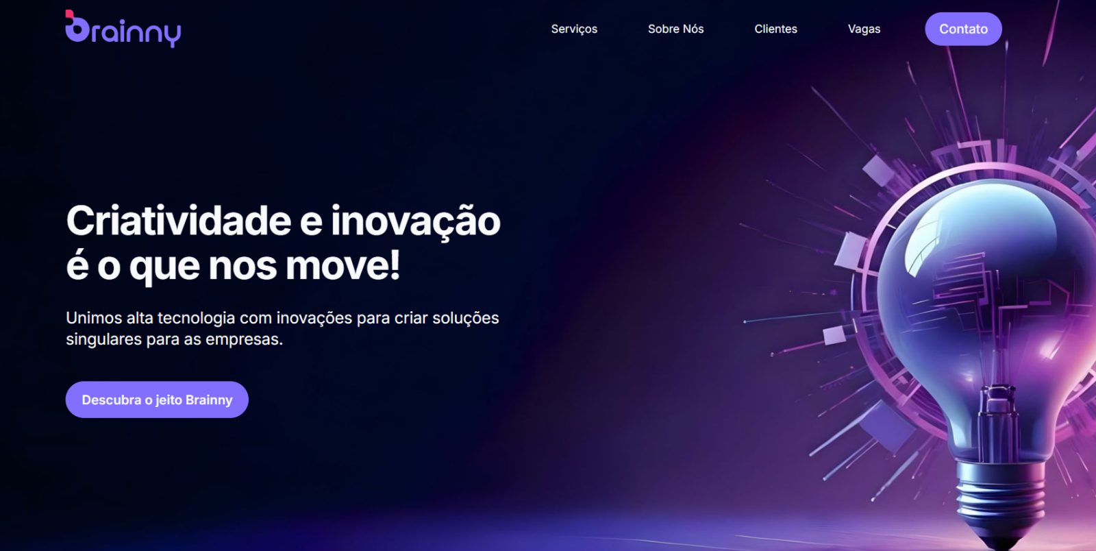
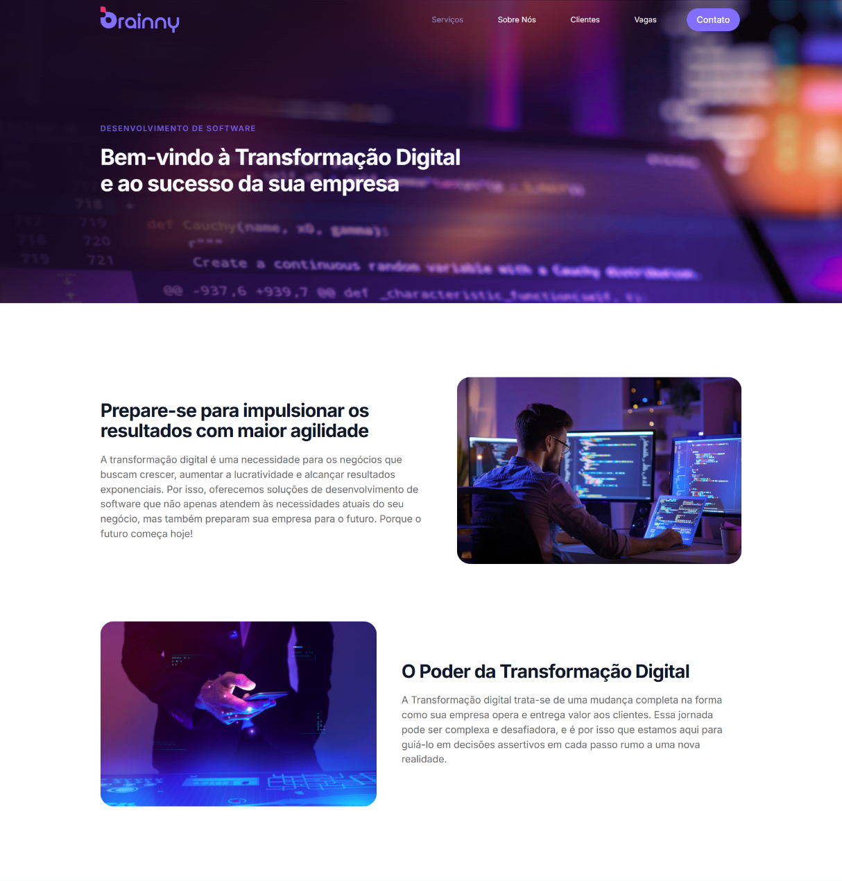
The homepage introduced the brand first, then directed visitors deeper only when they were ready
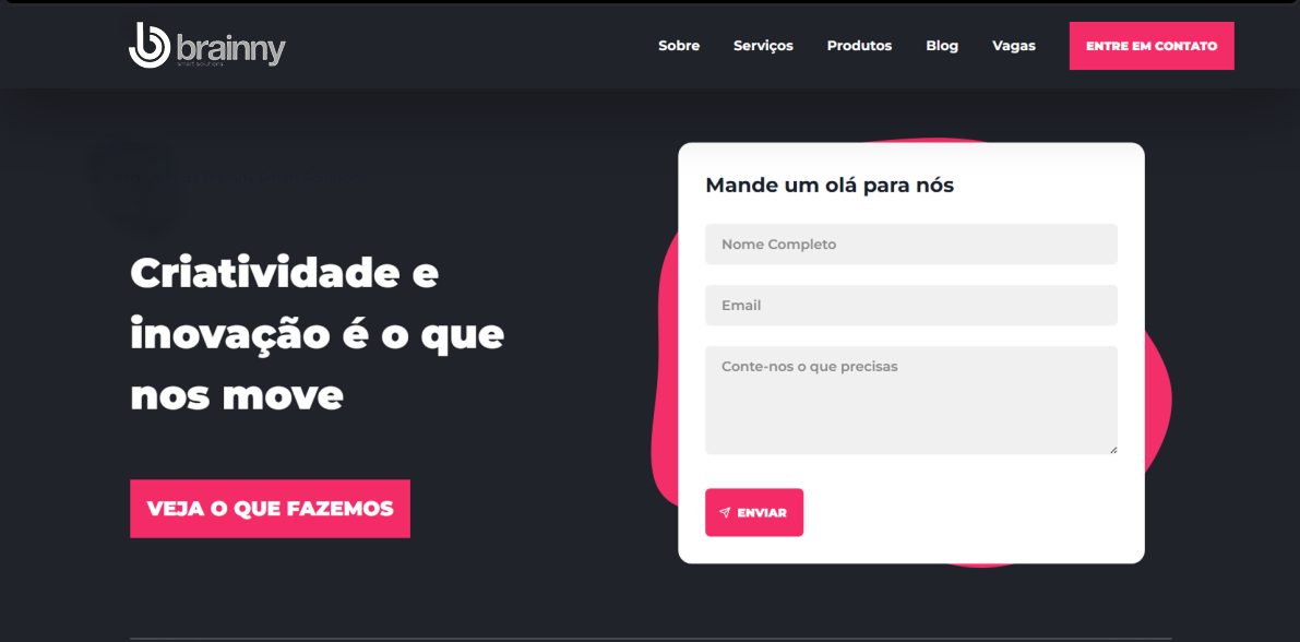
Instead of presenting all four services at once, the homepage focused on Brainny's core identity through bold messaging and a strong visual first impression.
Service pages explained how Brainny works, not just what Brainny offers
Each service page was organized around methodology rather than feature lists. By showing the path from research to delivery, the site positioned Brainny less like a vendor and more like a strategic partner.
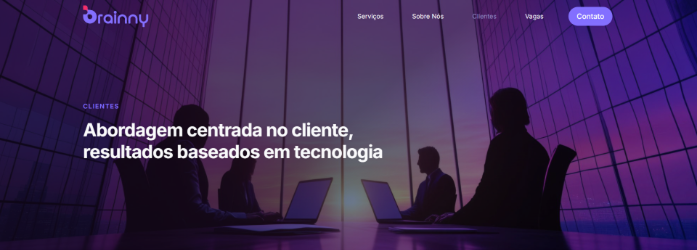
Color became part of the navigation system, not just part of the rebrand
The new brand palette was applied consistently across every page — the purple and pink accents, and a rhythm of dark and light sections — so the site felt like one cohesive system rather than a set of loosely related pages.
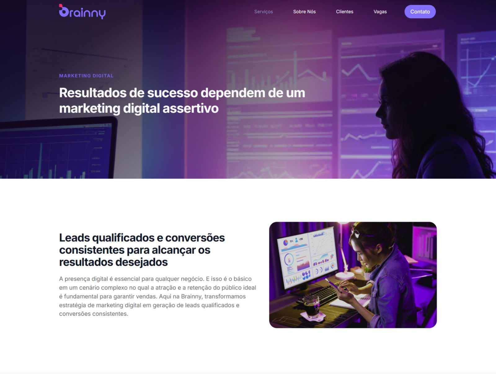
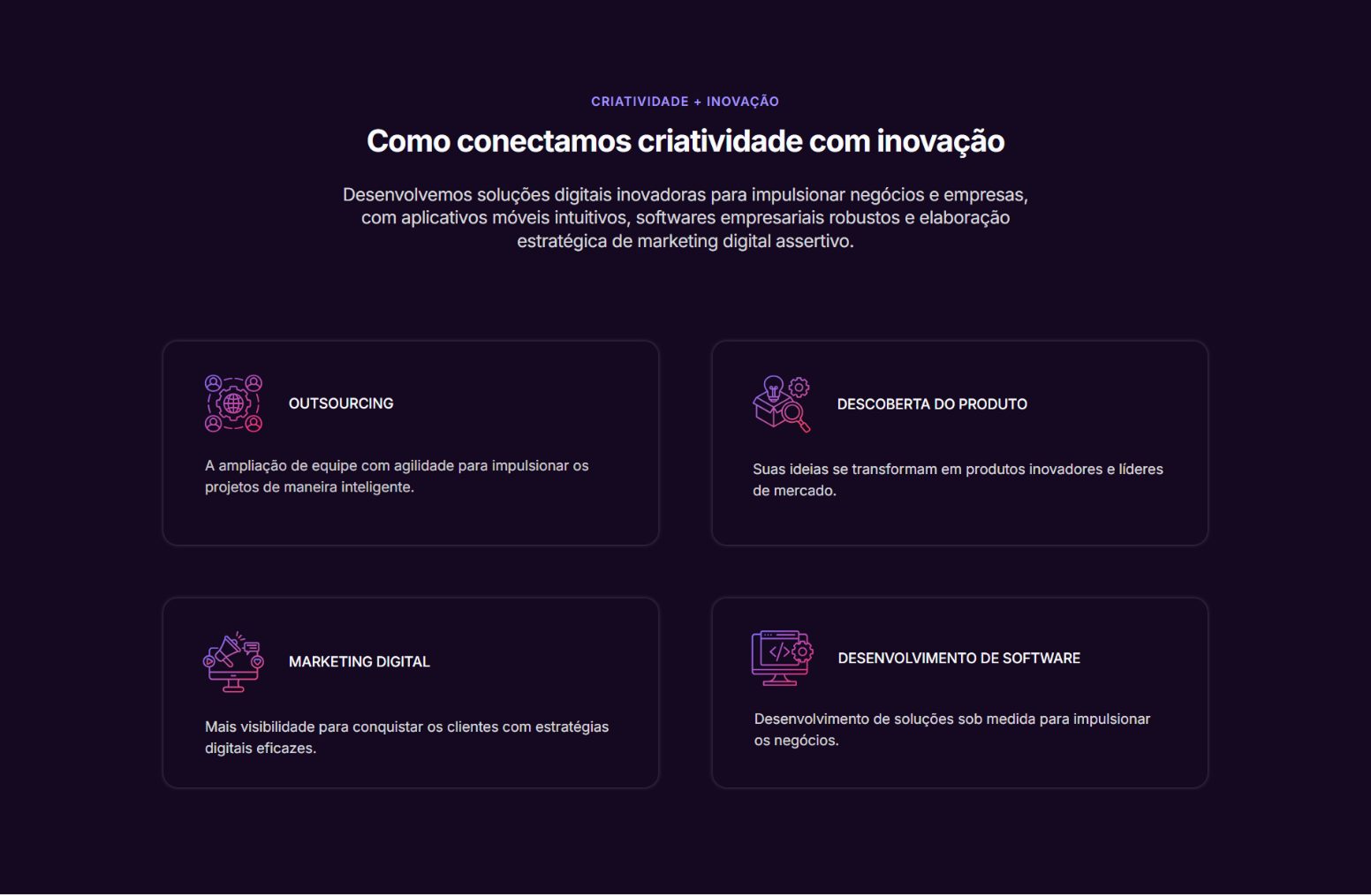
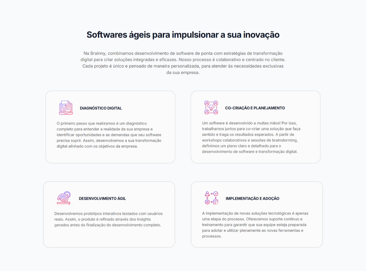
Navigation signaled company maturity as much as site structure
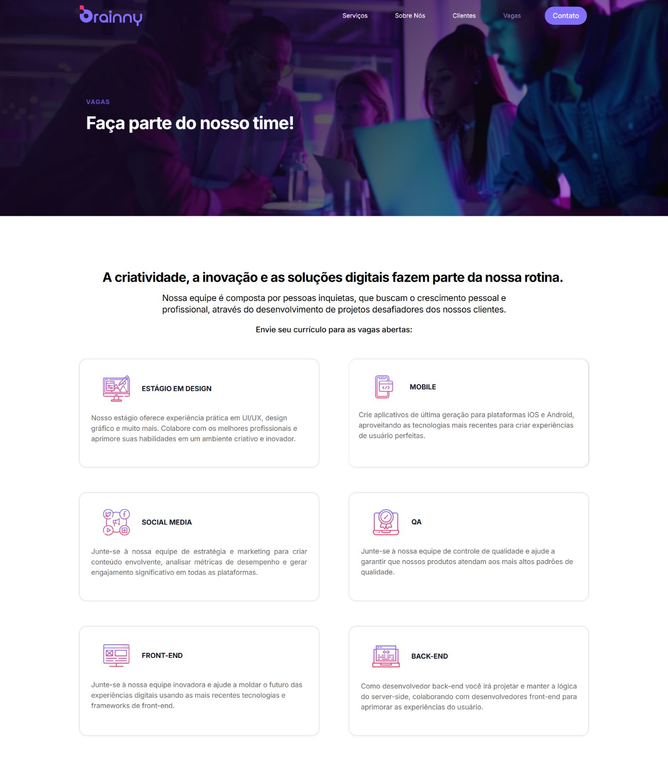
The Careers page was placed in the main navigation alongside Services, because hiring visibility also worked as proof of team quality and business growth. In a B2B context, that reinforced trust, not just utility.
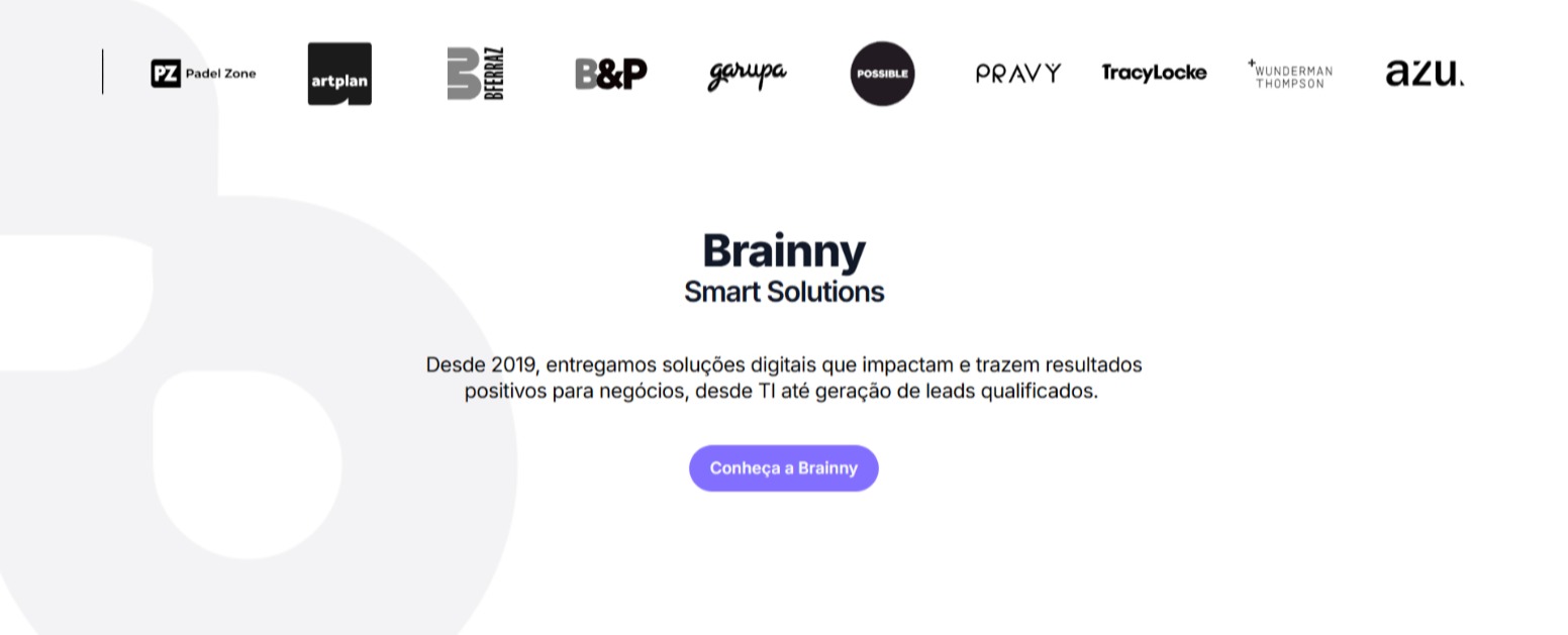
Proof of versatility appeared early, before visitors had to search for it
A compact client carousel near the hero gave visitors an immediate sense of industry breadth, while a dedicated Clients page expanded that proof with a larger grid — making Brainny's experience easy to scan at both a glance and a deeper level.
The redesign made the brand clearer, the services easier to understand, and the next step easier to take.
The final site applied the rebrand consistently across pages, clarified service differentiation through structure, and used hierarchy to make trust signals more visible. It also reduced conversion friction by making calls to action easier to spot and giving visitors a more confident path from first impression to deeper exploration.
- •
Rebrand applied consistently across all pages.
- •
Services differentiated through clearer structure, not more copy.
- •
A CTA hierarchy that made next steps easier to spot.
- •
Trust signals strengthened through navigation and client proof.
With more experience, I'd approach this with an even more restrained visual system and a stronger focus on content clarity — leaning further on spacing and hierarchy, and tightening the messaging so the site could communicate the offer faster and with less friction.
This project also shaped how I think about the relationship between design and content. Today I'd get involved earlier in UX writing and message structure, working alongside the team from the start — because when design and copy are shaped together, the value proposition lands more clearly and the path to action feels more confident.
Working with a no-code platform and limited resources meant I couldn't rely on custom development or expensive features. That forced clarity: what truly differentiates Brainny? The answer wasn't in complex interactions — it was in how information was structured: progressive disclosure, strategic navigation placement, dual-format social proof. The constraints drove better decisions than unlimited freedom would have.
Aprova
A mobile-first, AI-powered platform for Brazil's university entrance exam, built around access, feedback, and study confidence.
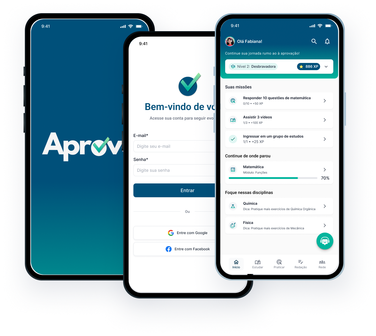
The product had to make high-stakes exam preparation feel more accessible, practical, and possible.
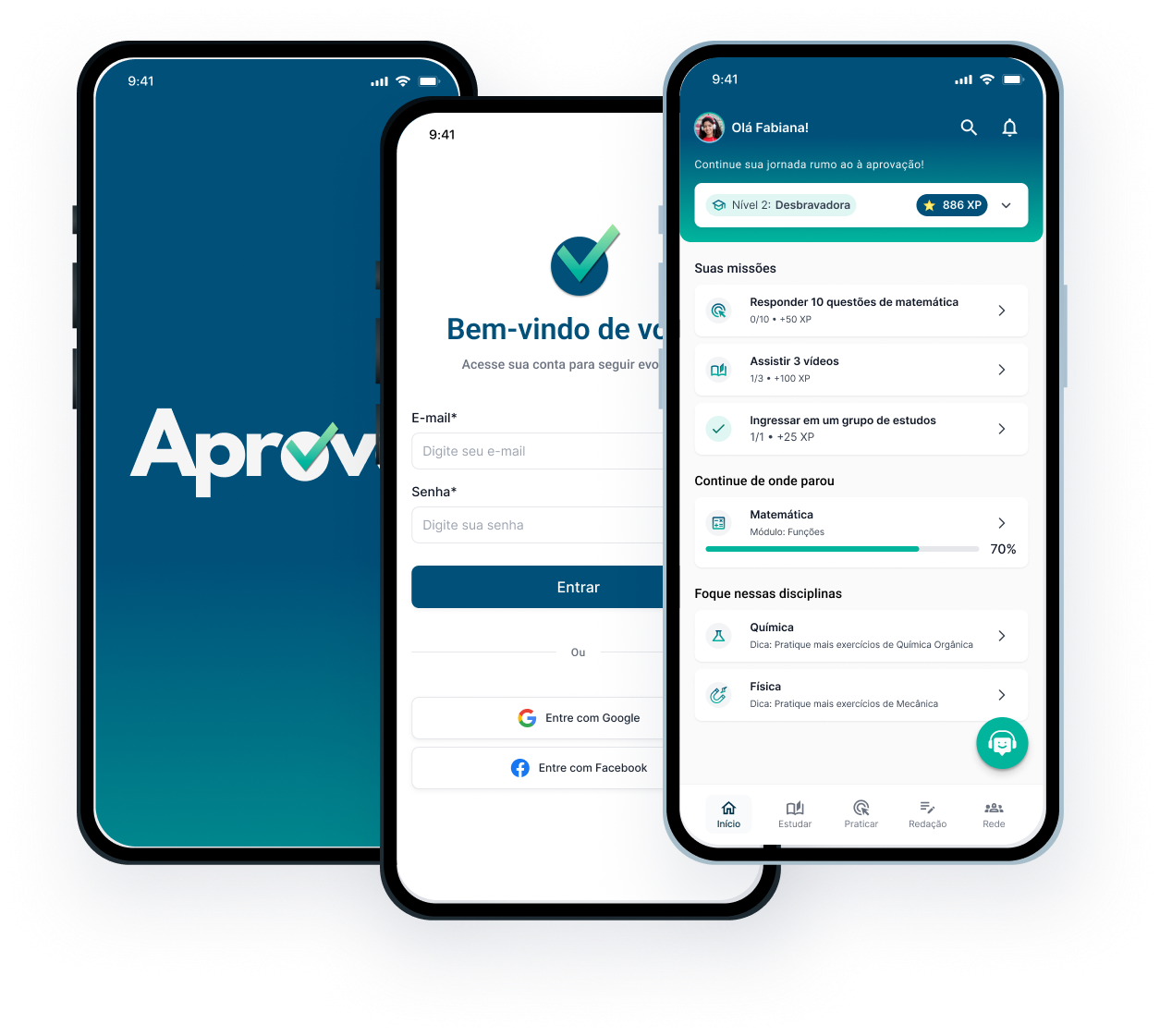
Brazil's ENEM exam — the national standardized test used for university entrance — plays a major role in access to higher education, but many students preparing for it do so with limited resources, inconsistent feedback, and smartphone-only access. The project focused on designing a platform that could respond to those conditions more realistically.
The research pointed to one clear constraint: the product had to work for motivated students studying under limited conditions.
Desk research across government data, academic publications, and EdTech market reports revealed recurring patterns: students often studied exclusively on smartphones, had inconsistent internet access, lacked regular essay feedback, and relied heavily on passive study methods. The product had to support progress within those limits rather than assume ideal learning conditions.
89% own smartphones, but only 41% have consistent broadband.
Public schools average 1 teacher per 28 students, limiting guidance.
62% show low academic self-efficacy despite high motivation.
78% study exclusively via smartphone (small screens: 4–5 inches).
No platform combined ENEM specificity, intuitive UX, genuine freemium access, and mobile-first design in one place.
Brazilian AI-based platforms tended to be too complex, while international products with better usability were too generic for ENEM preparation. The opportunity was to design something more specific, more accessible, and easier to use consistently on mobile.
Mapping the market against the four things this audience actually needs, every platform fell short on at least one — usually accessibility or price.
I approached it as an accessibility problem shaped by context, not as a feature race.
The central question became: how could the platform help students study more effectively without assuming stable internet, large screens, strong prior confidence, or teacher support? That pushed the work toward mobile-first flows, clearer learning structure, supportive feedback, and AI features that removed friction instead of adding complexity.
The platform was designed for smartphones first because that was the main study environment
Every screen was structured for mobile use before anything else. This respected the reality that many users studied only on smartphones, and helped reduce cognitive load for students with lower digital confidence.

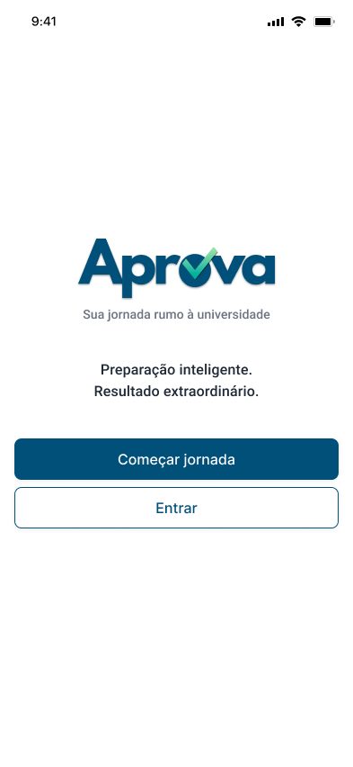
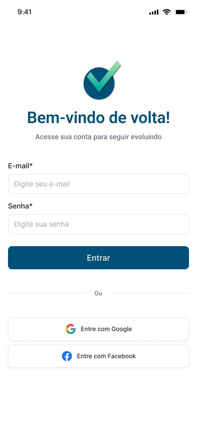
Onboarding collected the context needed for adaptation without making setup feel overwhelming
The first-use flow gathered personal, socioeconomic, and goal-related information to build a more relevant learning profile. That let recommendations and difficulty adapt over time while keeping the initial experience understandable.
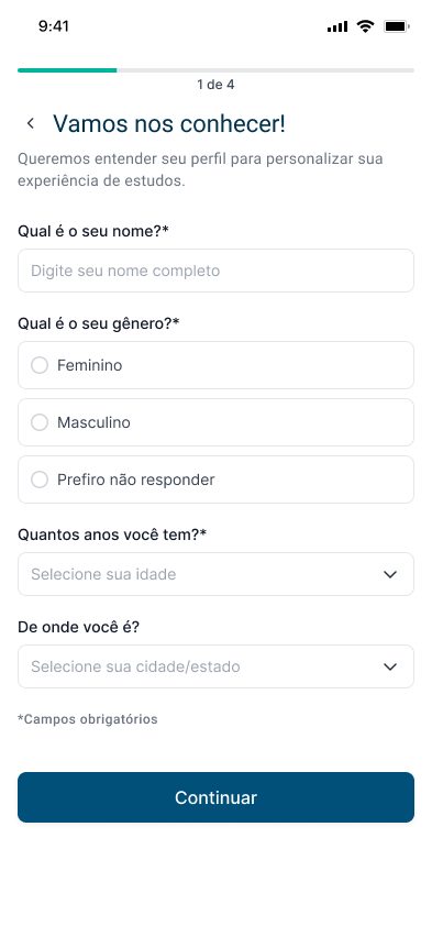
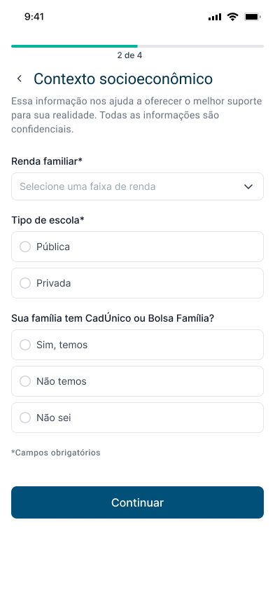
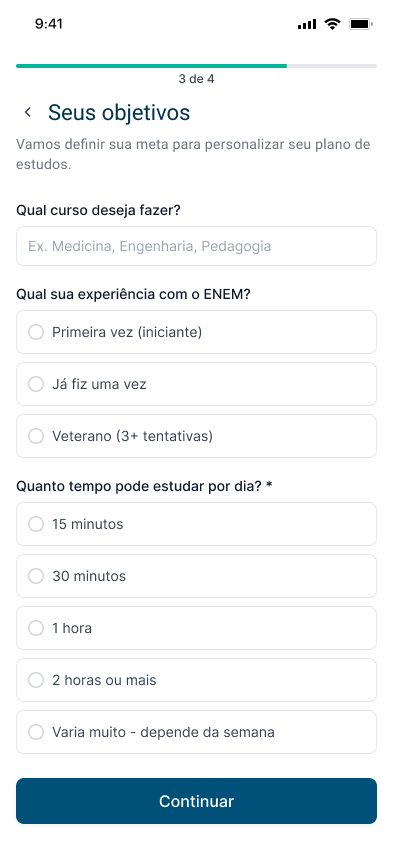
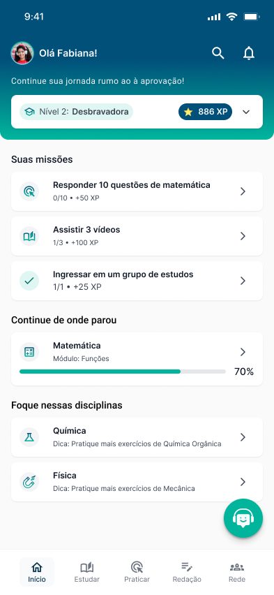
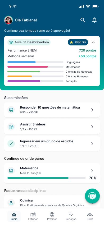
The dashboard showed what mattered first, then revealed detail only when students needed it
Overview cards highlighted progress and weak areas at a glance, while deeper breakdowns stayed available on demand. This kept the interface useful on small screens without flattening everything into one layer.
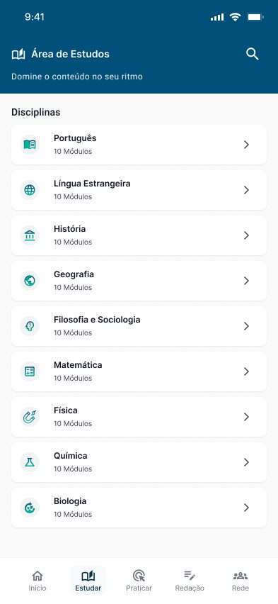
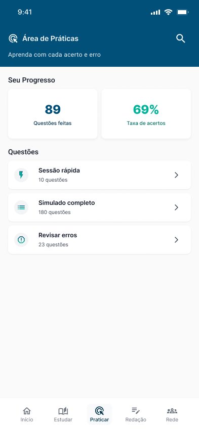
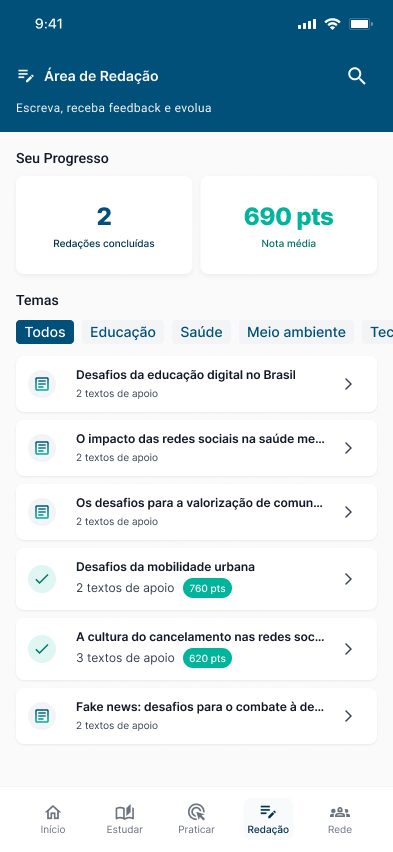
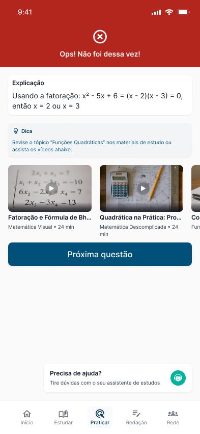
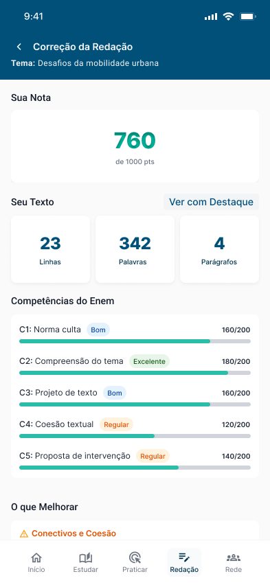
The platform separated learning into three modes that matched how students actually prepare
Study organized lessons and reading, Practice handled adaptive questions, and Writing focused on essay feedback based on ENEM competencies. The structure made the platform easier to navigate while connecting each activity to a clear purpose.
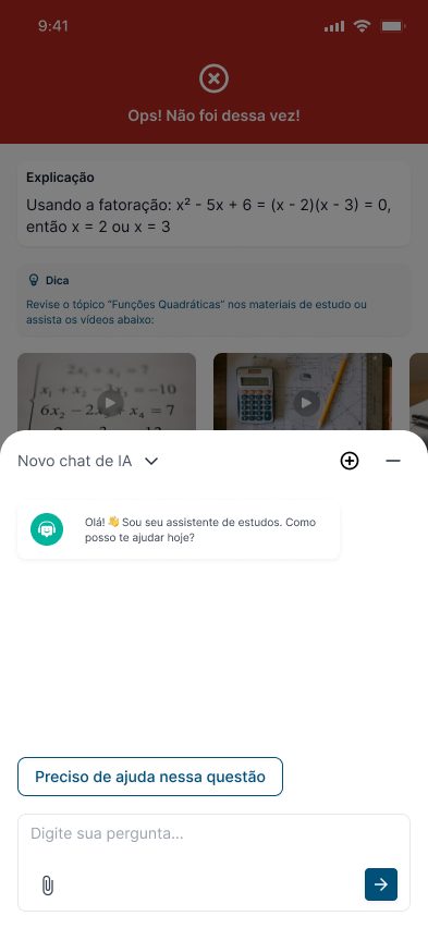
AI was used to guide learning, give feedback, and offer support — not to dominate the experience
Aprova used predictive personalization for difficulty adjustment, automated writing feedback tied to ENEM evaluation criteria, and a contextual assistant for navigation and study support. The goal was to make AI feel practical and helpful rather than intimidating.
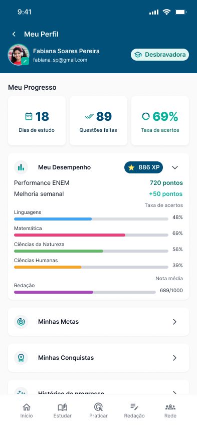
Progress needed to be visible because motivation alone was not enough
Points, levels, and badges helped compensate for the lack of consistent feedback many students experienced in traditional schooling. Visible progress systems were designed to reinforce effort, continuity, and a stronger sense of capability.
From "ENEM AI" to "Aprova"
The project started as "ENEM AI," but I renamed it partway through. Said aloud, "ENEM AI" sounds like "tô nem aí" — Brazilian slang for "I couldn't care less" — the exact opposite of what the product is about.
"Aprova" speaks to what students actually want — getting in — is easier to say and remember on a phone, and leaves room to grow beyond the ENEM later. A small change, but it reframed the product around hope instead of the tool.
Early testing showed the concept was understandable, but readability still needed work.
Usability testing with two target users showed the platform's purpose was clear, the separation between Study, Practice, and Writing felt intuitive, and the achievement system encouraged engagement.
The most important issue uncovered was readability: font sizes felt too small on 4–5 inch screens, especially in low-light conditions.
- •Increase base font sizes.
- •Implement responsive scaling and test usability across screen sizes.
- •Test contrast in varied lighting.
- •Expand testing to 4–6 users.
The project turned research on educational inequality into a concrete, testable product direction.
Aprova turned research on educational inequality into a concrete product direction, shaping a mobile-first experience around real study conditions and access barriers. The concept used AI in a focused way, and early testing made the next round of improvements clear.
Mobile-first design was grounded in real study behavior.
Access barriers were translated into clear product decisions.
AI worked as practical support, not a gimmick.
Testing validated the concept and exposed readability issues.
Inclusive design isn't just about removing cost barriers. It means designing for real conditions — small screens, inconsistent internet, limited feedback, and students who need the platform to be clear enough to use consistently without support.